Images
Images in Owlbear Rodeo are designed to support many different use cases. Commonly you will use images for maps and player characters. However, you can also use images for a variety of other things such as attachments, notes and props.
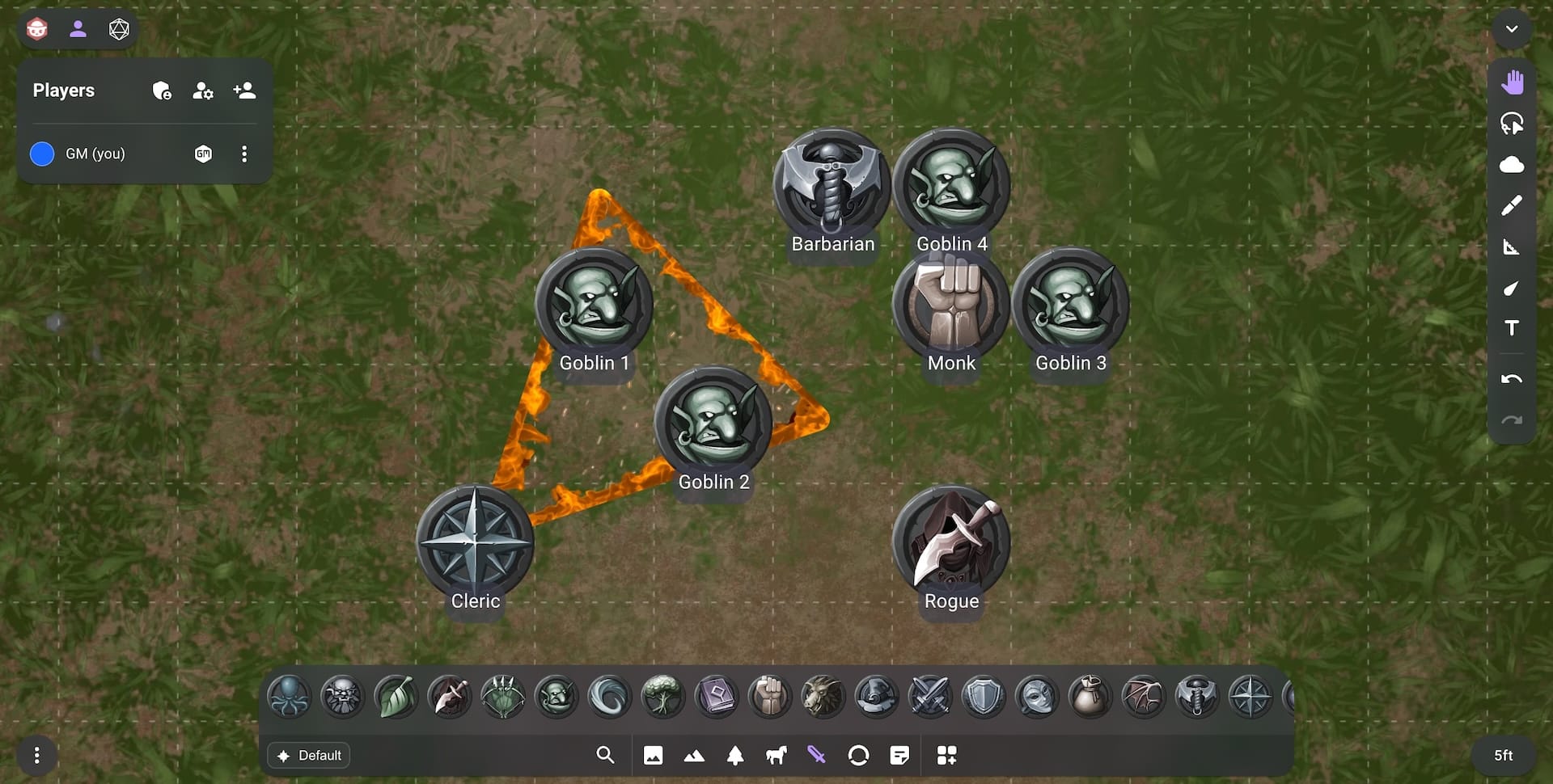
Image Types
In Owlbear Rodeo images are organized into a variety of types. These types help simplify the image system in a few ways. They allow a base level of organization that helps keep your images where you expect them. Each image type will also give a hint to Owlbear Rodeo on how to use the image. For example each image type is given its own layer so that you don’t have to manage the layering of all your images.
Below is a list of the images types and their intended usage:
| Type | Icon | Description |
|---|---|---|
| Map |  | Maps are the base layer for your encounter and sit below the grid. Maps are locked by default so you don’t accidentally move them. |
| Prop |  | Props sit on top of your maps and grid. They can be used for stationary props such as treasure chests or trees. Props can also be used for spell effect templates or visuals. |
| Mount |  | Mounts sit above props and are used for vehicles or animals. When dragging a character from the dock on to a mount it will be attached to that mount. |
| Character |  | Characters sit above mounts and are used for enemy or player characters. |
| Attachment |  | Attachments sit above characters. Attachments are most used for status effects but can also be used for swords or equipment. When dragging an attachment from the dock it will attach to a character if dropped on to it. |
| Note |  | Notes are the top layer of images. Notes provide a rich text editor on top of the provided image. |
Using Images
Images can be added to a scene by dragging them from the Dock.
Once an image has been added to a scene it can be moved, resized and more.
Moving Images
With the Move tool selected a image can be moved by dragging it to the desired position. By default there will be some slight grid snapping that will snap the image to the grid. If you wish to temporarily disable this snapping you can hold the Ctrl/Cmd key while dragging. To disable grid snapping completely for everyone in the scene the GM can use the Grid Controls described here. To adjust the sensitivity of the grid snapping for the current user you can use the Settings page found in the Extras Menu at the bottom left of a room.
Editing Images
To further interact with an image you can select it by clicking on it in the scene. A locked image can be selected by double clicking.
Once selected a context menu will be shown below the image. This menu will allow you to change various properties on this image.
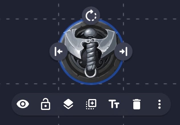
Below is a list of all the menu items for a image:
| Menu Item | Icon | Description |
|---|---|---|
| Hide/Show |  | Hides or shows the image. A hidden image will be transparent for GMs but completely hidden for players. Only GMs can control this value. |
| Lock/Unlock |  | Locks or unlocks the image. A locked image can’t be moved using the move tool and can only be selected with a double click. |
| Layer |  | Change which layer the image is on. |
| Duplicate |  | Duplicate the image. |
| Edit Text |  | Edit the label or rich text for the image. |
| Delete |  | Delete the image. |
| More |  | View an overflow menu of more menu items |
When clicking the more button you will see a popover menu of more items. This menu can also be accessed directly by right clicking on the image.
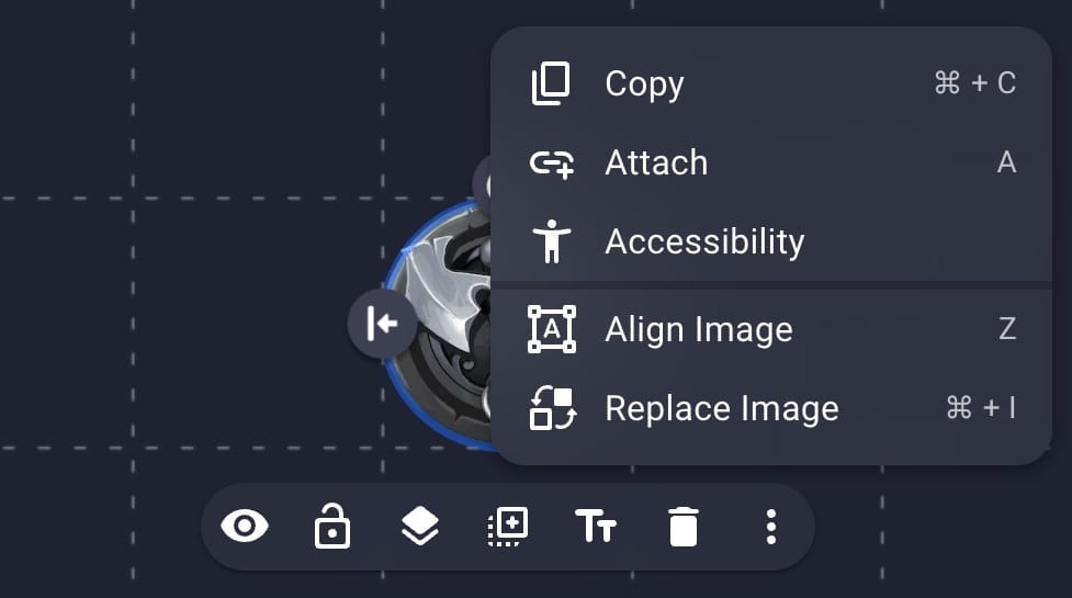
Below is a list of all the overflow menu items for an image. The overflow menu is also where extensions may choose to add functionality so your list may include more items.
| Menu Item | Description |
|---|---|
| Copy | Copy the image. |
| Attach/Detach | Attach or detach this from another item. |
| Accessibility | Set a name and description used by assistive technology. |
| Align Image | Open a more detailed editor for the image. See here for more information. |
| Replace Image | Replace the image with another image from your library. |
Transforming Images
To resize or rotate an image use the provided handles on the top or sides of the image when it is selected.
For more advanced controls you can use the Align Image option in the overflow menu described above.
Managing Images
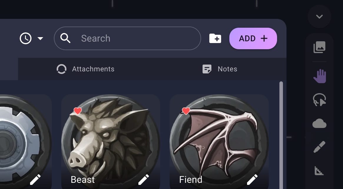
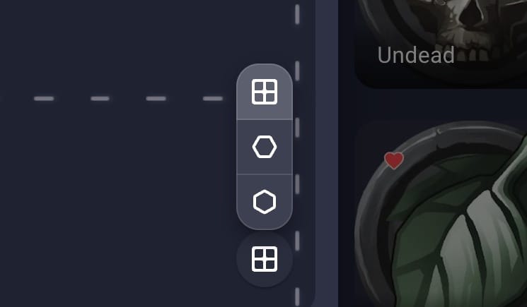
The Asset Manager allows you to create, edit or delete images. These images will then be shown in the Dock for quick access when you need them in your game. To open the Asset Manager use the Asset Manager button in the dock.
See the Assets guide for more information on using the Asset Manager.
Adding Images
To add a new image select the tab representing the type of image you wish to add. For example to add a new character select the Characters tab. Once the correct tab is active click the Add button in the top right.
This will open the Image Importer. The Image Importer is split into two tabs. The Starter Sets tab allows you to add a new asset from an image built in to Owlbear Rodeo. The New tab allows you to upload your own custom images.
For a guide on using the starter sets see the Getting Started guide.
To add a new image select the New tab. The New tab is split into two sections. On the left is a large area for you to import and preview new images. On the right are a set of import settings which allow you to control the default values of each image.
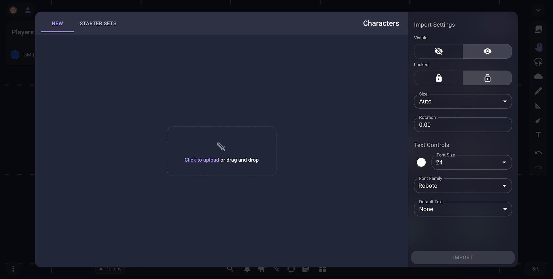
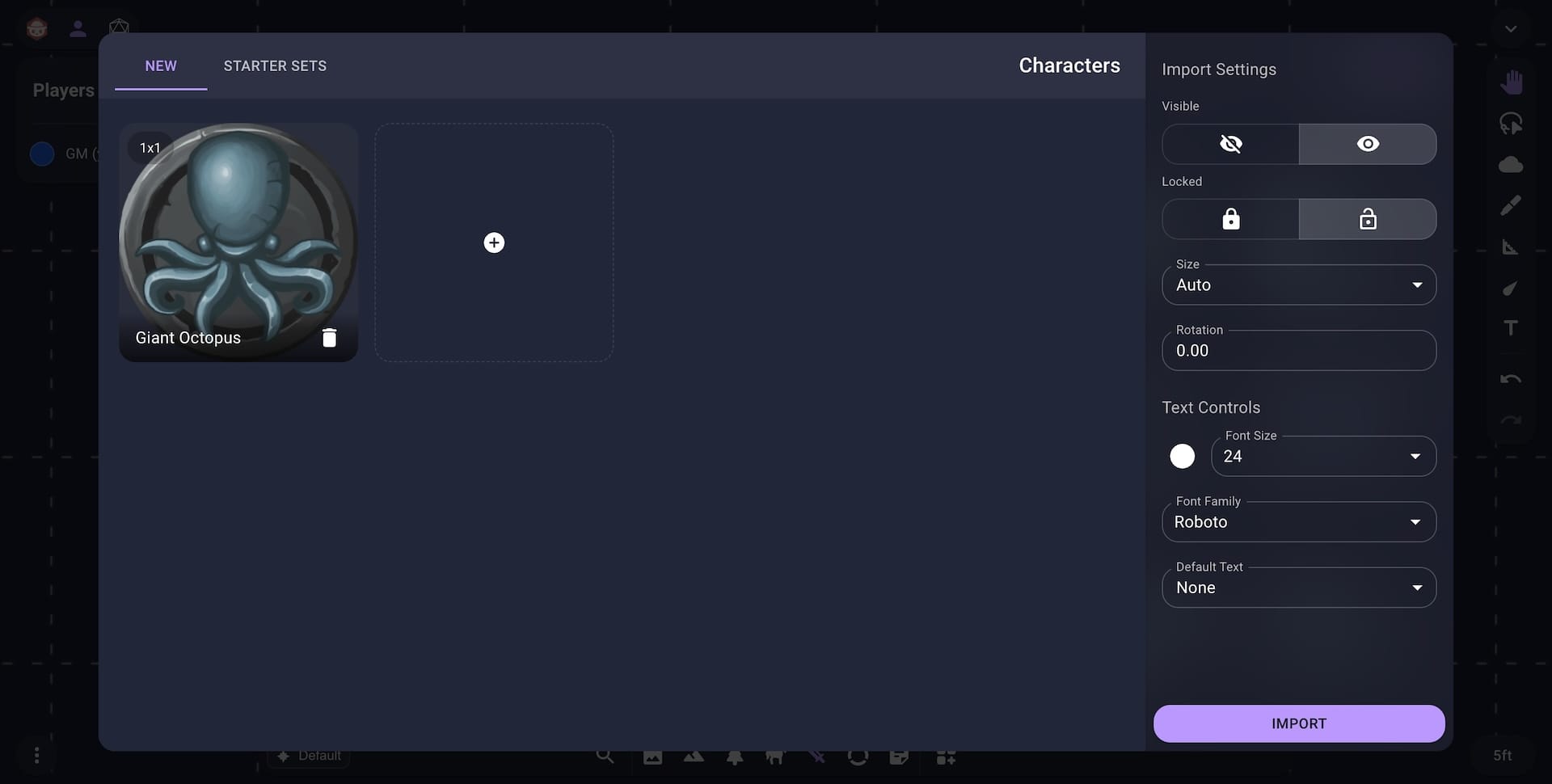
To upload new images either click the Upload button or drag and drop your images from your computer into the upload section. Once an image has been added to the left section you will see a preview of that image. To stop that image from being uploaded you can click the delete button.
Below is a breakdown of the import settings available on the right side of the New Image Importer:
| Setting | Description |
|---|---|
| Visible | The default visibility of the images. |
| Locked | The default locked state of the images. |
| Size | The size of each image. The Auto option will calculate the size based on the image type and resolution. The Set DPI option will use a fixed DPI for each image. The Set Columns will use a set number of columns for each image. The Set Rows option will use a set number of rows for each image. |
| Rotation | The default rotation of the images in degrees. |
| Text Color | The default color of any label or text for the images. |
| Font Size | The default font size of any label or text for the images. |
| Font Family | The default font family of any label or text for the images. |
| Default Text | The default text or label for the images. The None option will keep the text blank. The Copy Image Name option will use the filename for the image text. The Custom option will allow the same input text for each image. |
Once you have selected your desired settings click the Import button in the bottom right to begin importing your new images.
Editing Image Defaults
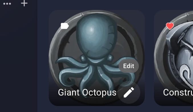
To edit an image once it has been added click the Edit button on the Image tile.
This will open the Image Editor. The Image Editor will allow you to adjust the default values of your image. These default values will be used when you drag your image into a scene.
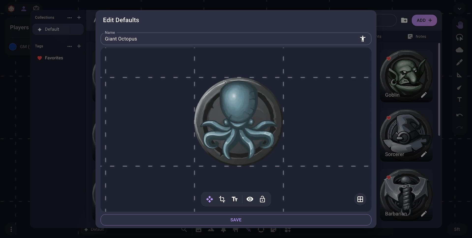
At the top of the Image Editor you can adjust the name and description of your image. Both of these will be used by assistive technologies once the image is added to a scene. In the middle of the editor is a preview viewport that shows how your image might look in a scene. At the bottom of the editor is a toolbar which allows you to edit your image.
Below is a breakdown of each option in the Image Editor toolbar:
| Menu Item | Icon | Description |
|---|---|---|
| Pan |  | Move the preview viewport. |
| Transform |  | Adjust the rotation and scale of the image. See here for more information. |
| Text | | Adjust the default text for the image. |
| Hide/Show | | Adjust the default visibility for the image. |
| Lock/Unlock | | Adjust the default lock/unlock state for the image. |
To see how this image may look in different grid configurations use the Grid button in the bottom right.
Once you are done with your edits click the Save button on the bottom of the Image Editor to save your changes.